
Refonte

La Refonte insights
A beautiful website is not enough: it needs to convert. Discover the seven principles of effective web design, the trends shaping 2026 and the process behind a website that works for your business.
Refonte

Design

SEO
Your website creates a first impression of your business in less than 50 milliseconds. That is all the time a visitor needs to form an aesthetic judgement and decide, subconsciously, whether your brand is credible. There is no time to read. No time to understand your offer. Just an immediate visual impression.
Website design is not a matter of taste or personal preference. It is a discipline that combines psychology, communication and technology with one clear objective: persuade a visitor to stay, read and, ultimately, contact you or make a purchase.
This guide is for you if you want to understand what makes a good website design in 2026, if you are considering a redesign of your existing site or if you want to brief an agency with confidence. To explore UX in more depth, our article on the importance of a UX redesign is a useful companion piece.
A common mistake is to confuse beauty with effectiveness. A website can look impressive yet convert very poorly. Conversely, websites that may appear functionally unremarkable, such as Amazon and Craigslist, generate billions in revenue. Effective web design sits at the intersection of aesthetics, usability and commercial communication.
A good website design performs three functions at once. It communicates your brand identity: visitors should understand who you are and what you do within seconds. It guides the user journey: every visual element directs attention and action towards what you want visitors to do next. It also builds trust: people perceive the visual quality of a website as a signal of the quality of the offer behind it.
A Stanford study, regularly cited in the UX industry, found that 75% of users assess a company's credibility based on its website design. For an SME selling services worth several thousand euros, an outdated-looking website may be the reason a prospect chooses a competitor, even when your offer is objectively better.

Étape 1
The human eye does not scan a page linearly: it follows a hierarchy. Size, colour, contrast and spacing all tell visitors what to look at first. A clear H1, a subheading that explains the benefit and a visible CTA form the minimum hierarchy for an effective page. If everything looks equally important, nothing is.
Étape 2
The recommended minimum body-text size is 16px on desktop. The ideal line length is 60 to 75 characters, while the recommended line height is 1.4 to 1.6 times the font size. These figures exist for a reason: beyond these limits, reading becomes uncomfortable and abandonment rates rise. Typography is not decoration; it is communication.
Étape 3
Colours, fonts, icons and spacing: a coherent design system across every page creates an impression of professionalism and control. By contrast, a website where every page looks as though a different person made it signals disorganisation, which erodes trust. Consistency does not mean uniformity; it means reassuring predictability.
Étape 4
Even the world's most beautiful design is worthless if the page takes five seconds to load. Performance is now a fundamental part of web design. Choosing modern image formats such as WebP and AVIF, optimising fonts and avoiding render-blocking scripts all have a direct impact on user experience and SEO. A slow website loses an average of 53% of its mobile visitors.
Étape 5
More than 60% of French web traffic comes from mobile devices. A website designed for desktop first and then 'adapted' for mobile nearly always delivers a compromised mobile experience. The right approach is the reverse: design first for mobile constraints, including smaller screens and touch interactions, then enhance the experience for desktop. It is more demanding, but it produces websites that are genuinely usable on every device.
Étape 6
An accessible website is not merely a legal obligation, such as RGAA compliance for public services in France. It is an opportunity to reach more people and improve the experience for everyone. Sufficient contrast between text and background, with a minimum ratio of 4.5:1, alternative text for images and functional keyboard navigation benefit the 15% of the population living with a disability while improving readability for all users. To go further, our guide to web accessibility and the RGAA covers the legal requirements and technical criteria you need to meet.
Étape 7
The call to action is the most important element on your page and the one most often handled poorly. A good CTA is visible, with a contrasting colour and sufficient size; explicit, such as 'Request a free quote' rather than 'Click here'; and contextual, appearing at the right point in the reading journey. A CTA's position, wording and colour can change the conversion rate by 30% to 200%.
Web trends evolve quickly, and not all of them deserve to be followed. Here is what is genuinely relevant for an SME in 2026, with a clear distinction between what improves the experience and what is purely aesthetic.
Functional minimalism continues to dominate. Fewer elements, more white space and more direct messaging. This trend is not incidental: it responds to users' increasingly fragmented attention. A pared-back website loads faster, is easier to read on mobile and forces you to clarify your message. An SME that replaces an overcrowded homepage with a clear page built around one message and a strong CTA will typically see its conversion rate increase by 20% to 40%.
Micro-interactions are becoming more refined. These are not spectacular animations that slow the site and overwhelm the eye, but subtle movements that communicate the state of the interface, such as a button hover, the progressive loading of an image or confirmation that an action has been completed. These small details create an impression of quality and care that strengthens trust.
Expressive typography is emerging as a powerful differentiator. In highly competitive markets, choosing a distinctive typeface, perhaps a carefully selected display face for headings paired with a highly readable body font, is a simple way to stand out visually without overloading the design.
On the performance side, optimisation for Core Web Vitals is now a design constraint, not an optional extra. Our guide to Core Web Vitals explains the metrics you need to optimise so that your design performs as well as it looks.

Conversion rate is the true measure of your design's performance. Not design awards or compliments from people you know, but the percentage of visitors who complete the action you want them to take. For an SME brochure website, that usually means submitting a contact form or making a call. For an ecommerce website, it means placing an order.
Consider a real example. An accountancy firm in Lyon contacted us because its website generated few enquiries despite receiving a healthy 800 visits per month. We identified a design problem: the only way to contact the firm was through a 12-field form at the bottom of the Contact page, which itself sat behind a navigation menu with eight entries. We added a 'Book an appointment' button to the header and reduced the form to four fields. The result: enquiries tripled within a month, with no change in traffic.
Another often underestimated lever is social proof. Client reviews, logos of businesses you have supported and key figures, such as years of experience, satisfied clients and completed projects, all reduce friction in the decision-making process. An undecided visitor who sees that '127 SMEs trust us' is statistically more likely to make contact than someone visiting a website that offers no evidence of its experience. To maximise conversion on a page dedicated to a specific offer, our complete guide to landing pages explains the best practices for conversion-led design.
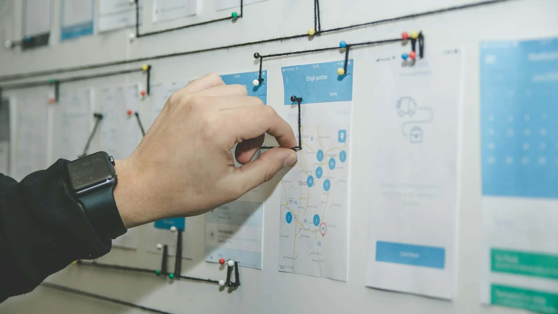
Good website design does not begin by opening Figma. It begins with understanding your users, your objectives and your competitors. This is how a rigorous web design project unfolds. For a practical continuation, see Responsive Web Design.
Strategy comes first. Who are your target visitors? What do they intend to do when they reach your website? Which keywords do they enter into Google? Which websites do they visit before yours? These questions shape every design decision that follows. A website for a B2B manufacturing SME should not be designed like one for a lifestyle shop, even though both need thoughtful design.
Next comes UX design: the website structure, the layout of content blocks and wireframes, or website mock-ups. At this stage there are no final colours or fonts, only structure and content. This is when you validate the logic of the navigation, not the aesthetics.
UI design follows: colours, typography, iconography, illustrations and photography. This is the stage clients see first and often want to accelerate. Skipping UX to move straight to UI consistently produces websites that look good but function poorly.
Finally come development and testing. Even the best design remains theoretical until it has been implemented and tested on real devices, including an entry-level Android smartphone, not only the latest iPhone. If you are considering working with an agency on your web design, our website design service covers every phase, from strategy to launch. If your existing website needs a complete overhaul, our website redesign service is the ideal place to start. For a closer look at planning your content, read our guide to structuring your website.
Website design is an investment, not an expense. A well-designed site converts more effectively, ranks more strongly because performance supports SEO, and projects a professional image that can justify higher prices. For an SME competing against businesses with uniformly outdated websites, good design offers a lasting competitive advantage. To take this further, read UX Redesign.
Be wary, however, of aesthetics for their own sake. Design must always serve a business objective: more enquiries, more sales and greater trust. Measure the impact of every design decision against your key metrics, including conversion rate, time on site and pages per session. What cannot be measured cannot be improved. For a practical continuation, see Lean UX.
If your current website no longer reflects the quality of your work, if prospects arrive and leave without getting in touch, or if you feel embarrassed to share your URL, it is a clear sign that a redesign is needed. Design is only the visible surface of a deeper process of strategy and restructuring. Our page on Website Redesign Checklist explains the next step.
UX, UI and responsive design: we create websites that look beautiful and work hard for SMEs.
Keep exploring


A project in mind?
Start with a free audit grounded in your goals, website and data.
Discutons de votre projet
30 min · Google Meet
Choisissez le créneau qui vous convient dans notre calendrier. On analyse votre situation avant l’appel pour aller droit au but.
Finding available times...