

Refonte

La Refonte insights
Responsive design is no longer optional: 63% of global web traffic comes from mobile. This guide explains how to make your site responsive, why it matters for SEO and when to consider a redesign.
Refonte

Design

SEO
Your site looks perfect on a desktop computer. But what do visitors see when they open it on their phone? Text that is too small, buttons that are impossible to tap, a menu that spills off the screen... Hundreds of SMEs still face this problem today, without realising what it is truly costing them.
Responsive design is the technical answer to that problem. It is not a cosmetic trick, but a fundamental approach that determines whether your site converts visitors or sends prospects to a competitor. This complete guide explains what responsive design is, why it has become non-negotiable and how to tell whether your site is up to standard in 2026.
Mobile usage in numbers, 2026
63%
of global web traffic comes from mobile
53%
of mobile users leave a site that takes more than 3 seconds to load
2x
more conversions on a mobile-friendly site
100%
of websites are indexed mobile-first by Google
Responsive web design is a web design technique that allows a single site to display properly on every screen size, from smartphones and tablets to laptops and large monitors. The layout automatically adjusts to the available resolution, without requiring a separate version of the site.
The term was popularised by Ethan Marcotte in a seminal 2010 article for A List Apart. It has since become the industry standard. Developers previously often built two separate sites: a "normal" desktop site and a mobile version at m.yoursite.co.uk. They were a nightmare to maintain, frequently performed poorly and delivered a dreadful user experience.
Today, one site and one codebase can adapt to every device. That is responsive design. Technically, it relies on three pillars: fluid grids, flexible images and CSS media queries, which we explore in more detail below.
In 2026, having a non-responsive site is like running a shop whose doorway is too narrow for half of your customers. You are not explicitly turning them away, but they cannot get inside.
The figures are unequivocal: more than 63% of global web traffic comes from smartphones. In some sectors, including hospitality, trades and local services, that figure exceeds 75%. One of our construction clients received 71% of its visits on mobile, yet its site had been designed exclusively for desktop in 2016. The result was an 84% mobile bounce rate and no inbound calls through the site. After a responsive redesign, the bounce rate fell to 41% and quote requests tripled within three months.
Beyond user convenience, there is an even more pressing reason: Google. Since 2021, Google has indexed all sites mobile-first. This means your mobile version, rather than your desktop version, determines how your site ranks in search results. A site that performs poorly on phones is a site that drops down the SERPs. This is not a trend; it is the reality of technical SEO in 2026. You may publish the best content in the world, but if your site is unreadable on mobile, Google will not reward it.
Responsive design relies on three CSS mechanisms working together. For a practical continuation, see UX Design.
Fluid grids replace fixed widths in pixels with proportions expressed as percentages. Where an old website might set a column to exactly 600px, a responsive site says, "this column occupies 60% of the available width". It therefore resizes naturally to fit the screen.
Media queries are conditional CSS rules. They apply different styles according to the screen size. On a screen narrower than 768px, typically a smartphone, the three columns of a desktop grid stack vertically. Buttons become wider so they are easy to tap with a thumb. The navigation becomes a hamburger menu. This is where the responsive "magic" happens, although it is code rather than magic.
Flexible images complete the picture. An image declared with max-width: 100% never overflows its container, whatever the screen size. Modern browsers go further with the srcset attribute, which serves different images according to the resolution: a lightweight image on mobile and a high-resolution version on desktop. This also directly supports Core Web Vitals and perceived performance.
These three elements form the foundation. In practice, a well-built responsive site goes further, using fluid typography that adjusts with clamp(), adaptive spacing, carefully chosen breakpoints and components designed for touch rather than a mouse.
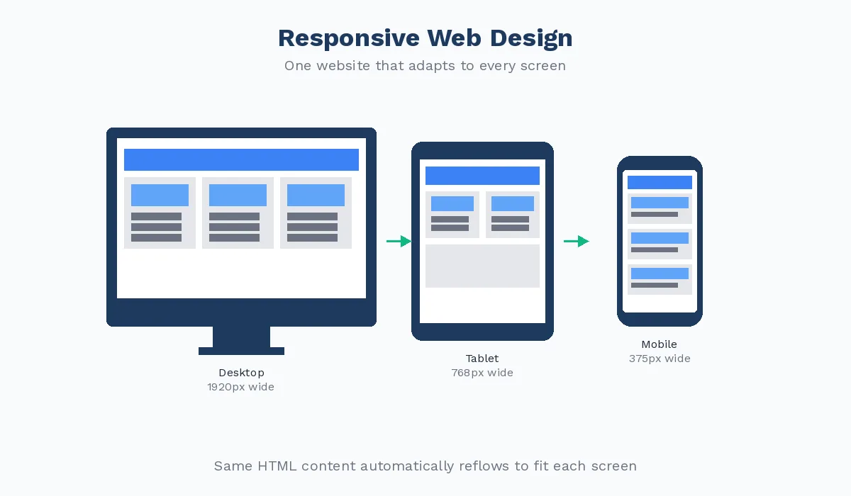
A question often comes up: why not create a dedicated mobile version, as major websites did in the 2010s? The answer is simple: it is a poor approach for three reasons. To take this further, read Website Maintenance.
First, it means twice the maintenance. Every content change must be applied to both versions. A bug may appear in one but not the other. In practice, the mobile version always falls behind and eventually becomes a ghost of the main site.
Second, it causes fragmented SEO. Two different URLs for the same content look like duplication to Google. Even with correctly configured canonical tags, you split your domain authority. You do twice the work for half the result.
Finally, there is the proliferation of devices. In 2026, people access the web on phones, 7-inch tablets, 12-inch tablets, 13-inch laptops, 27-inch monitors, 65-inch TVs and now augmented-reality glasses. A responsive site adapts to all of them by definition. A "mobile" site adapts only to phones.
The only valid exception is a highly complex web application where mobile and desktop interactions are fundamentally different, such as a design tool like Figma or a trading platform. For an SME brochure site or ecommerce website, responsive design is always the right answer.
The quickest method is to open your site on your phone. Do you have to zoom in to read? Are buttons too close together? Is the menu usable? If you answer yes to any of these questions, you have your answer.
For a more detailed diagnosis, Google provides a free Mobile-Friendly Test in Google Search Console. It analyses your page and tells you clearly whether it is mobile-friendly, including any problems detected. It is also a useful starting point for a complete website audit.
Modern browsers also include developer tools with a device emulator. In Chrome, press F12, then select the phone icon at the top left. You can simulate any device and test your pages without leaving your computer. Pay particular attention to navigation, forms, images and text. Is the navigation accessible? Can the form fields be used comfortably? Do images resize properly? Is the font large enough to read without zooming?
For another useful indicator, compare the bounce rates of mobile and desktop visitors in Google Analytics. If the mobile bounce rate is 30 to 40 percentage points higher than the desktop rate, that strongly suggests a problem with the mobile experience. One digital marketing consultancy had a mobile bounce rate of 79%, compared with 38% on desktop. An audit revealed that the contact form was inaccessible on smartphones because its submit buttons extended beyond the screen. Three weeks after the redesign, mobile leads had increased by 210%.
Retrofitting responsiveness to a non-responsive site is often close to impossible. You can layer more CSS over an old desktop site and try to force elements to bend when they were never designed to do so, but the result is usually an expensive patchwork that does not last. It is like trying to bring a 1980s kitchen up to modern standards: eventually, replacing it costs less than repairing it.
The following signs suggest you need a complete redesign rather than a series of fixes:
Your site is more than five years old and has never been redesigned. CSS frameworks have changed radically, and code considered sound in 2018 may be obsolete today. Your mobile bounce rate remains above 65%. Your site uses a CMS or theme without native responsive support. Your competitors have smooth, fast mobile sites while yours takes six seconds to load over 4G.
A responsive redesign is more than a technical project. It is an opportunity to rethink the information architecture, simplify user journeys and optimise conversions. Our web design service uses a mobile-first approach from the wireframing stage: we begin with small screens and progressively enrich the experience for desktop, not the other way round. If you are considering this step, our website redesign service can support you from the initial audit through to launch.
Étape 1
Analyse Google Search Console and Analytics reports to identify the pages most frequently visited on mobile and those with the highest bounce rates. These are your priorities.
Étape 2
List the key actions mobile visitors need to complete, such as calling, requesting a quote, finding an address or signing up. These actions should guide every design decision.
Étape 3
Start wireframes at 375px, a standard iPhone width, then expand to 768px for tablets and 1280px for desktop. Design every element for touch before considering mouse input.
Étape 4
Validate development across at least six screen and browser combinations: Chrome for mobile, Safari on iOS, Samsung Internet, Firefox for mobile and their desktop counterparts.
Étape 5
A responsive site also needs to be fast. Measure Core Web Vitals (LCP, CLS and FID) before and after the work to make sure the redesign improves SEO rather than undermining it.
Responsive design is no longer optional or a technical bonus reserved for large websites. It is the minimum standard for maintaining a credible online presence in 2026. With more than 63% of traffic coming from mobile and Google indexing sites exclusively mobile-first, a non-responsive site puts itself at a disadvantage in user experience, conversion rates and search rankings.
The good news is that a site which is not yet responsive, or is only partly responsive with a layout that fits but dreadful mobile performance, can be fixed. A well-managed redesign can transform your metrics within weeks. It is not simply a cost, but an investment with a rapid, measurable return. Our page on WP Rocket explains the next step.
If you are unsure where to begin, the first step is always an audit: understand what mobile visitors actually experience on your site today, identify the obstacles they face and build a realistic roadmap. That is exactly what we do for our clients at La Refonte. To take this further, read WordPress SEO.
UX, UI and responsive design: we create beautiful, effective websites for SMEs.
Keep exploring
A project in mind?
Start with a free audit grounded in your goals, website and data.
Discutons de votre projet
30 min · Google Meet
Choisissez le créneau qui vous convient dans notre calendrier. On analyse votre situation avant l’appel pour aller droit au but.
Finding available times...