Refonte

La Refonte insights
Discover the best tools for testing your website across screen sizes, plus a structured method for finding every mobile display issue.

Refonte

Design

SEO
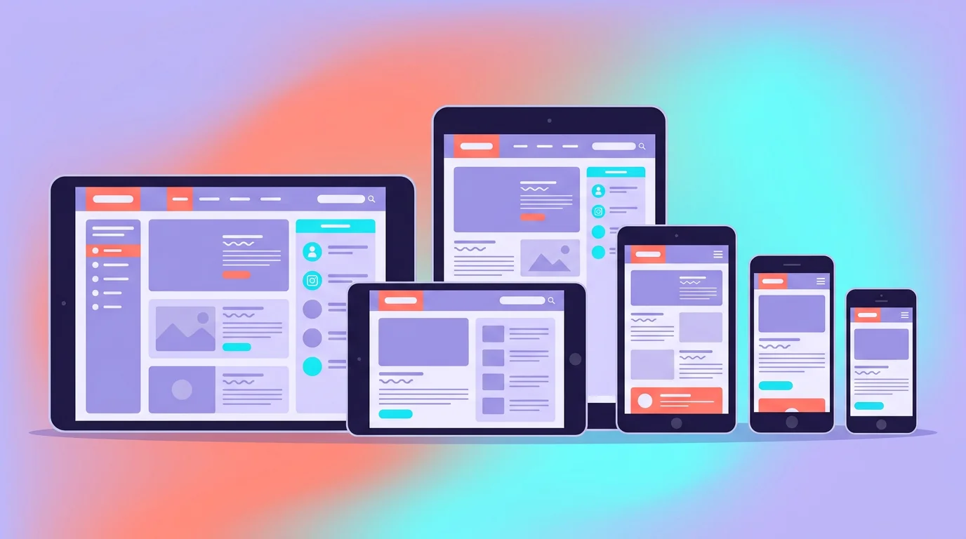
Testing a responsive website means systematically checking how it looks and behaves at different screen sizes, including smartphones, tablets and laptops. The aim is to provide a smooth, effective experience on every type of device your visitors use.
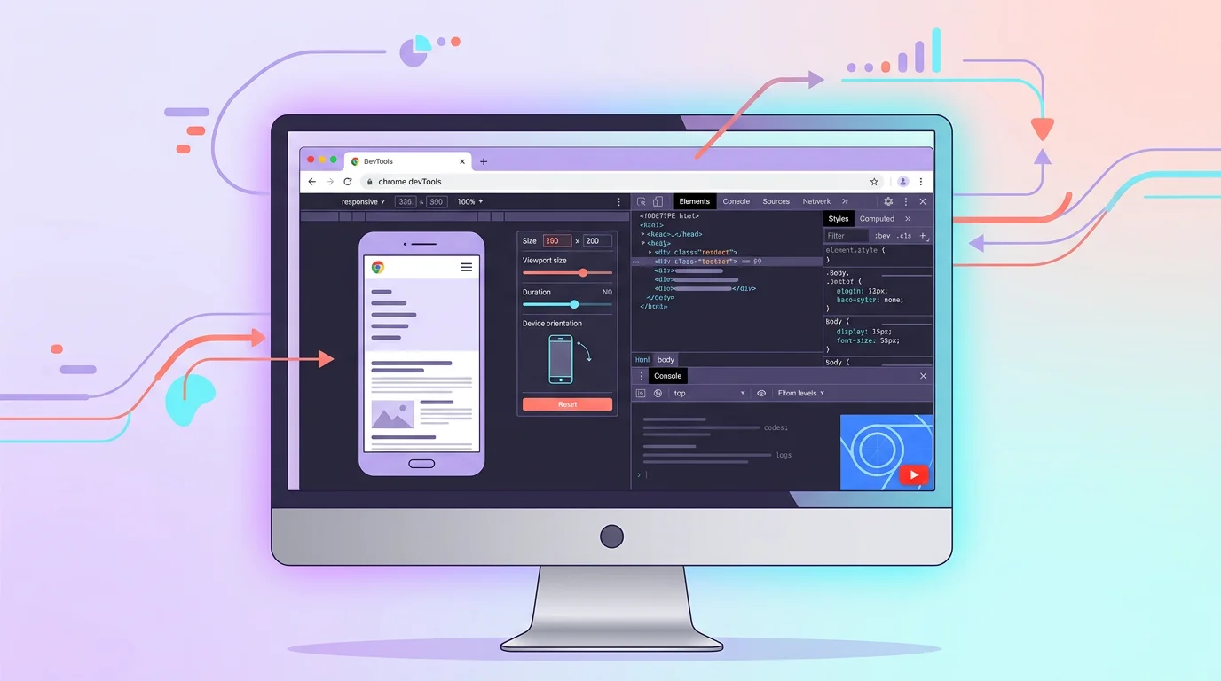
The quickest method is to open Chrome, press F12 and select the smartphone icon at the top left of the DevTools panel. You can instantly simulate any screen, including an iPhone, Galaxy or iPad, without installing anything. It takes three seconds.
A poor mobile display is more than a visual flaw. It can make a button impossible to tap, hide vital information or interrupt a conversion journey. Responsive testing therefore has a direct bearing on user experience and revenue.
The problem is that most SMEs simply resize their browser window. This reveals neither touch issues nor viewport bugs, and says nothing about real mobile performance. Here are seven tools that go much further, followed by a structured method that helps you miss nothing.
7 tools
compared across display, interactions and real devices
4 steps
to check breakpoints, touch, performance and a real device
10 to 30 min
to check key pages using the proposed method
Responsive-testing tools are not all equal. Some simulate a screen, while others test real interactions. Here is our selection, arranged by use case.
Built into Chrome, DevTools can simulate more than 30 devices. You can adjust the resolution, device pixel ratio, network connection and even the user agent. It is sufficient for the great majority of responsive checks: open your website, press F12 and select the smartphone icon. It takes three seconds.
Its greatest strength is the free-form 'Responsive' mode, which lets you drag the viewport one pixel at a time to find broken breakpoints. Combine it with the Lighthouse tab to run a mobile performance audit at the same time.
Enter a URL and Responsinator displays your website on ten popular devices in one scrollable page. There is no registration or configuration. It is ideal for a quick first diagnosis before you investigate further.
Its limitation is that it does not simulate touch interactions. You can see the display, but not the behaviour. A hamburger menu that fails to open on mobile will go unnoticed.
BrowserStack provides access to more than 3,500 combinations of browsers and devices. The Desktop plan starts at $29 per month when billed annually. Desktop & Mobile, which includes real mobile devices, starts at $39 per month, according to prices viewed in August 2026.
When should you use it? Whenever your website targets a particular device, such as a Samsung Galaxy A14 or iPhone SE, or an unusual browser. Emulators do not reproduce every hardware-specific rendering bug.
Lighthouse tests more than responsive behaviour. It assesses performance, accessibility, SEO and best practice. You can find it in Chrome DevTools under the Lighthouse tab or use it online through PageSpeed Insights.
Its report complements a visual test, but it neither reproduces every device nor provides an internal Google ranking score. Use it to examine Core Web Vitals and technical issues, then validate the interface on a real phone.
TestMu AI, the new name for LambdaTest, provides cross-browser testing, automated screenshots and parallel runs. Its Virtual Live plan starts at $15 per month when billed annually, while real-device access starts at $39 per month, according to prices viewed in August 2026.
Its value for SMEs lies in quickly producing a visual report across several configurations. Start with the virtual plan to check the display, then use a real device whenever the journey includes gestures, payment or another critical feature.
This basic online tool is nevertheless productive: enter your URL, choose a preset resolution for smartphone, tablet or desktop, and check the result. There is nothing to install, and it is free.
Its best use is quickly checking a particular CSS breakpoint. It is not suitable for functional or performance testing.
This free Chrome extension simulates 58 devices with the correct dimensions, device pixel ratio and user agent. It covers recent models, including Samsung foldables and the 12.9-inch iPad Pro, more comprehensively than DevTools.
Take care: like every emulator, it reproduces neither real performance nor touch interactions. It is ideal for checking the display, but insufficient for a complete assessment of mobile UX.
| 01Tool | 02Price | 03Real devices | 04Interaction testing | 05Best for |
|---|---|---|---|---|
| 01Chrome DevTools | Free | No (emulation) | Partial | Quick everyday testing |
| 02Responsinator | Free | No | No | Instant multi-screen previews |
| 03BrowserStack | $29 desktop / $39 mobile | Yes (3,500+ combinations) | Yes | Tests on specific devices |
| 04Google Lighthouse | Free | No | No | Performance and mobile audits |
| 05TestMu AI (LambdaTest) | $15 virtual / $39 real | Depends on the plan | Yes | Large-scale parallel testing |
| 06Responsive Checker | Free | No | No | Checking CSS breakpoints |
| 07Mobile Simulator | Free | No (emulation) | No | Previewing 58 recent devices |
Chrome DevTools
Responsinator
BrowserStack
Google Lighthouse
TestMu AI (LambdaTest)
Responsive Checker
Mobile Simulator
Étape 1
Open Chrome DevTools (F12, then the smartphone icon). Test your website at 375px (iPhone SE), 390px (iPhone 14), 768px (iPad) and 1024px (laptop). Look for horizontal overflow, truncated text and images extending beyond their containers. Record each issue together with the exact resolution.
Étape 2
Emulators do not simulate touch. Use your smartphone, or BrowserStack, to browse your website. Check that menus open correctly and that touch targets meet the WCAG 2.2 minimum of 24x24 pixels. Where possible, allow 44x44 pixels for greater comfort. Make sure forms can also be used easily with one thumb.
Étape 3
Run Lighthouse in mobile mode (DevTools, Lighthouse tab, then select Mobile). Aim for a Performance score above 70. Check that LCP (Largest Contentful Paint) remains below 2.5 seconds and CLS (Cumulative Layout Shift) below 0.1. A responsive but slow website is still one that visitors leave.
Étape 4
The final test must happen on a real phone. Visit your website on your own smartphone and complete the entire journey, from the home page through navigation to the contact form. Ask two or three colleagues to do the same on their devices. The most serious bugs always seem to appear on the device nobody anticipated.
Responsive testing checks the display. It does not check speed, accessibility or technical SEO. A website that looks perfect on mobile but takes six seconds to load is still a website nobody visits.
This approach works for brochure websites and blogs with fewer than 50 pages. Larger websites and ecommerce stores with complex purchasing journeys require a complete technical audit covering responsiveness, performance, accessibility and SEO together.
Another blind spot is that responsive tests do not uncover web-performance issues caused by unoptimised images or third-party scripts. A carousel may work visually at every screen size yet block the main thread for four seconds on an entry-level smartphone. Lighthouse identifies this kind of problem; a simple display test does not.
Open Chrome DevTools now, test your home page at the four critical breakpoints of 375, 390, 768 and 1024px, then record each issue. It takes ten minutes and can stop you losing visitors tomorrow.
A responsive test reveals symptoms: an element overflows, a menu disappears or a form becomes difficult to complete. It cannot explain why the interface was designed that way. Correcting these flaws after development often means revisiting the interface design, its components and sometimes the order of the content.
A page can fit within 390 pixels without being pleasant to use. A button placed too far down, overly dense navigation or a sales point buried within the page remain design problems. No responsive-design checker can assess the clarity of a journey or its action priorities on its own.
Mobile-first design prevents this debt. It starts with the most constrained screen, prioritises useful information, then enriches the layout for larger screens. This upfront work generally takes less time than a succession of scattered fixes after launch.
A mobile-design audit examines reading hierarchy, thumb-friendly navigation, touch targets, readability and the continuity of the journey. It also looks for hesitation caused by competing actions. To understand the method, consider how a UX consultant connects these observations to genuine user needs.
Structural flaws may require you to redesign the interface rather than move a few blocks. Display testing remains useful, but it then becomes the final check within a broader design process.
Testing is the first step, but design remains the foundation. Responsive design built mobile-first organises content and actions before handling CSS adaptations. This reduces the number of corrections discovered at the last minute.
You can also entrust the analysis to our Web Design team. Whichever approach you choose, keep the checklist below and use it to inspect the implementation before launch.
| 01Option | 02What it covers | 03When to choose it | 04Related page |
|---|---|---|---|
| 01Test it yourself | Display, breakpoints, touch and performance | Routine checks on an existing website | This article |
| 02Commission a design audit | Journeys, hierarchy, accessibility and interface | Identifying and prioritising structural problems | Design audit |
Test it yourself
Commission a design audit
Our developers test your responsive website on more than 15 real devices and correct every display issue. Receive a free visual audit within 48 hours.
Last updated: August 2026
Keep exploring


A project in mind?
Start with a free audit grounded in your goals, website and data.
Discutons de votre projet
30 min · Google Meet
Choisissez le créneau qui vous convient dans notre calendrier. On analyse votre situation avant l’appel pour aller droit au but.
Finding available times...