Refonte

La Refonte insights
A website mock-up prevents costly back-and-forth and speeds up launch. Follow a seven-step method, choose the right tools and avoid common mistakes for a professional result.

Refonte
Design

SEO
A website mock-up is a static visual representation of how a website is expected to look. It shows colours, typography, imagery and the arrangement of elements without including all the code or functional interactions. It provides a shared reference for the client, designers and developers. For a practical continuation, see Website Redesign Checklist.
A frequently repeated claim says that 72% of digital projects without mock-ups exceed their budget, supposedly according to PMI. We could not find a primary publication confirming that precise figure. The operational risk is nevertheless real: without a shared representation, every participant imagines a different website. The designer pictures a pared-back layout, the client expects a prominent promotional banner and the developer interprets the brief in their own way. Disagreements emerge only after the screens have been built.
A mock-up reduces this ambiguity. It allows the team to approve the website structure, priority content, components and mobile adaptations before implementation. It forms part of the design method that precedes the mock-up: understand users, organise their journeys, then make a solution tangible and testable. The practical choice is whether to build the skills needed to produce and maintain screens internally, begin with templates or delegate the design. This guide sets out seven steps, compares five tools and helps you select the right approach for your resources.
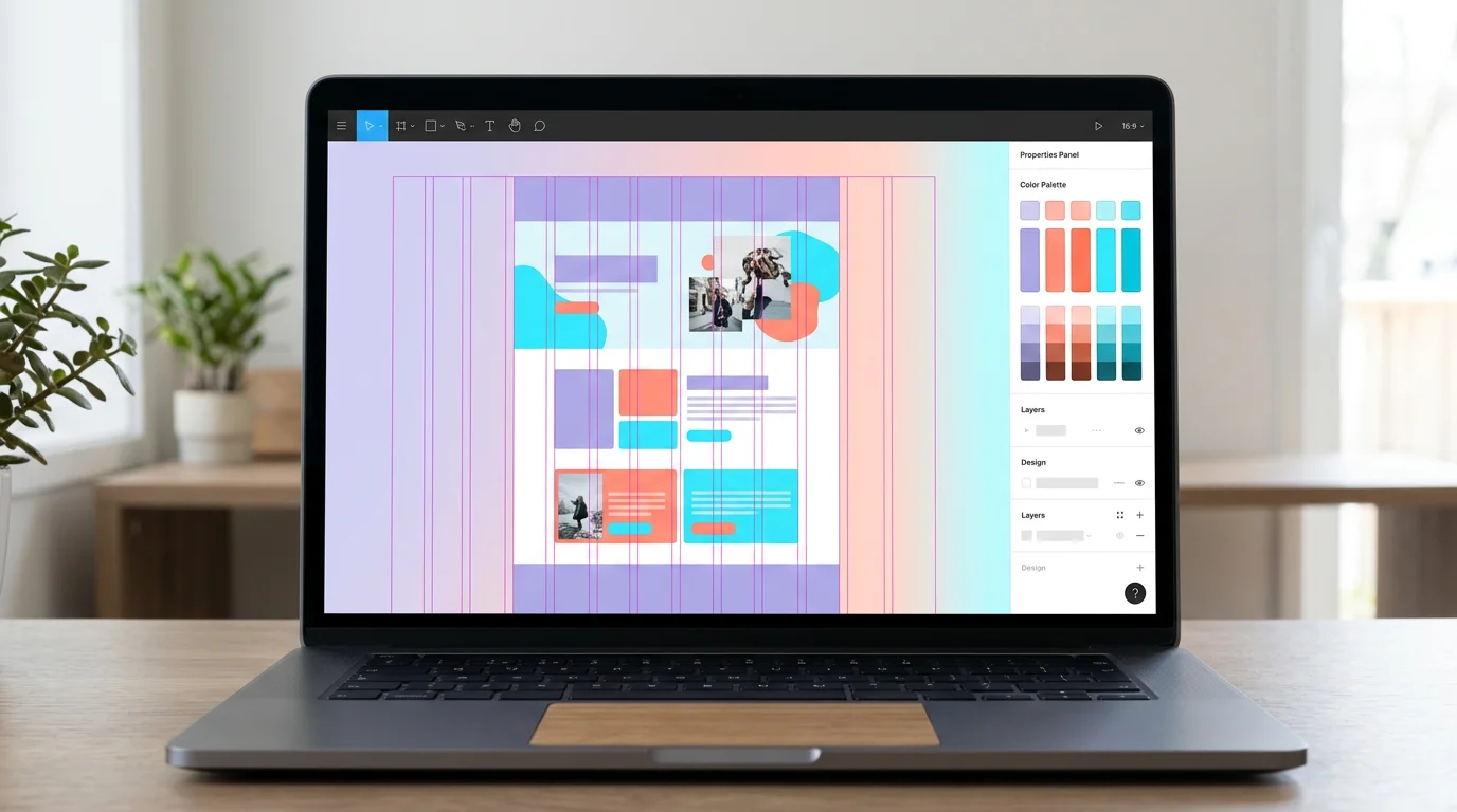
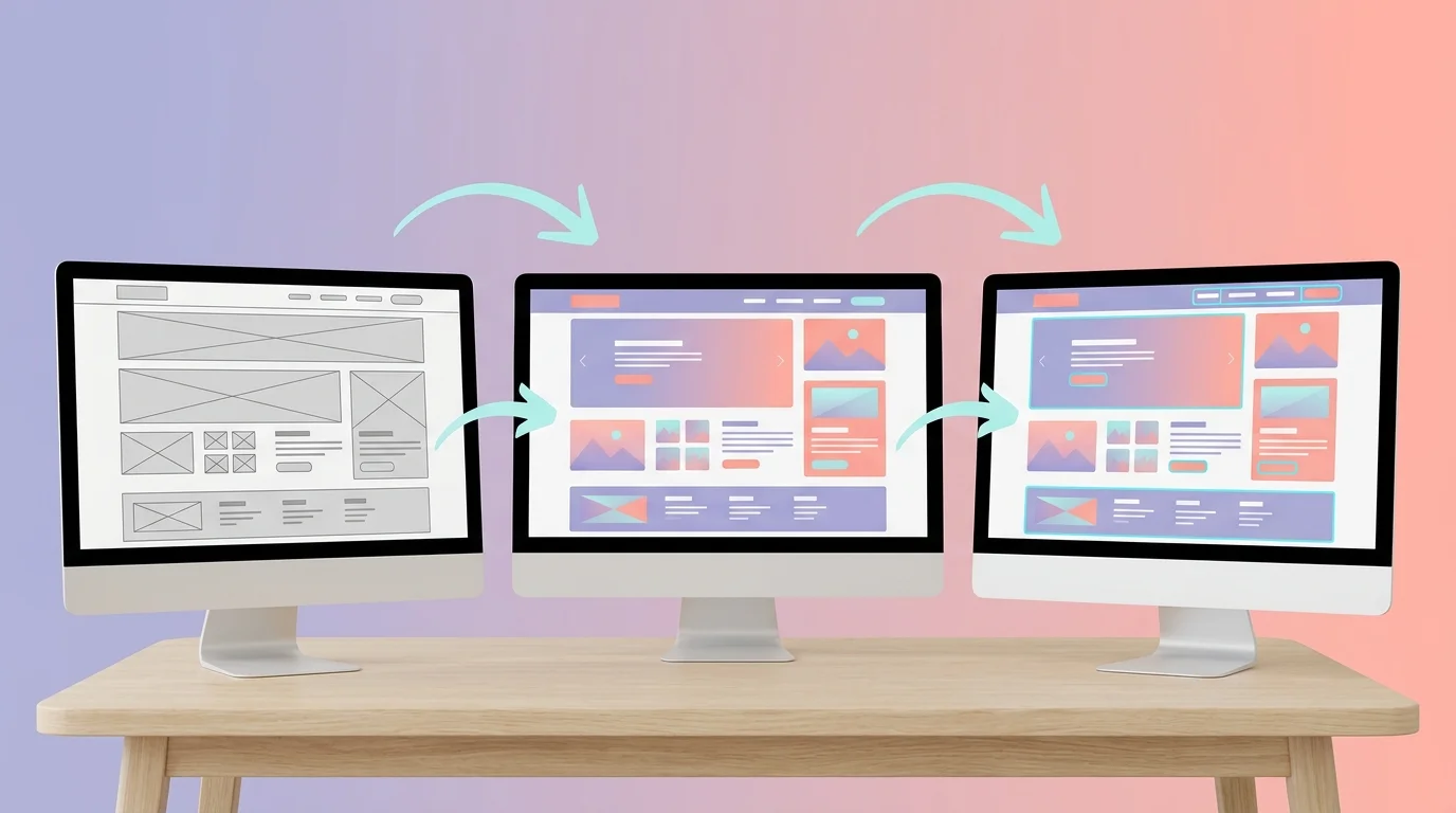
Website design progresses through three distinct levels of fidelity. Confusing them leads to planning errors. A wireframe is a skeletal diagram, often in greyscale. It represents the page structure: navigation, content areas, hierarchy, footer and primary actions. Its role is to validate the information architecture before investing in visual detail. The time required depends on page complexity and the number of variants to explore.
The visual mock-up adds the complete visual layer: colours drawn from the website's brand guidelines, typography, images, icons and spacing. It offers a realistic view of the final result but may remain static. This is the medium used for visual approval before development.
An interactive prototype simulates how the website behaves. Buttons trigger transitions, menus open and journeys connect. Figma and other prototyping tools can therefore test navigation before development is complete. The point is not to promise a universal percentage of avoided corrections, but to reveal misunderstandings, dead ends and hard-to-find actions earlier.
| 01Criterion | 02Wireframe | 03Mock-up | 04Prototype |
|---|---|---|---|
| 01Visual fidelity | Low (grey blocks) | High (colour, type and imagery) | High + interactions |
| 02Time per page | 1–3 hours | 4–8 hours | 6–12 hours |
| 03Typical tools | Balsamiq, paper, Whimsical | Figma, Sketch, Adobe XD | Figma, InVision, Axure |
| 04Purpose | Validate structure | Validate visual design | Test the user experience |
| 05Interactivity | None | None | Clicks, transitions, animation |
| 06Freelance cost (per page) | €50–€150 | €150–€500 | €300–€800 |
| 07Client deliverable | PDF/image diagram | Figma/PSD file | Clickable prototype link |
Visual fidelity
Time per page
Typical tools
Purpose
Interactivity
Freelance cost (per page)
Client deliverable
3
levels of fidelity: wireframe, mock-up and prototype
7
stages spanning scoping, design, adaptation and approval
3
reference breakpoints to plan for at minimum
5
tools compared by fidelity and collaboration model
Creating a website mock-up is not a cosmetic exercise. It makes decisions visible and reversible before code is written. Its value lies above all in the quality of those decisions: is the content in the right order, is the primary action obvious, and does every screen support the intended journey? A Lean UX approach can shorten cycles by alternating between hypothesis, mock-up, testing and learning.
A mock-up aligns every stakeholder around one vision. In an existing example involving a restaurant in Lyon, the spoken brief asked for a ‘modern and welcoming’ design. The mock-up turned that intention into concrete choices: a cream background, serif typography for menus and full-frame photographs of dishes. The client could respond to a precise artefact rather than abstract intentions.
It also reveals UX/UI issues before they become development fixes. Moving a button in a wireframe is generally simpler than changing an implemented component, checking regressions and redeploying. The more important a journey, the more useful it is to test the mock-up against real scenarios early. A UX consultant can help frame these tests when the team lacks the method or outside perspective.
An existing example from a Bordeaux clothing retailer illustrates the point: two product-page variants were compared before development, particularly the visibility of the add-to-basket action and the prominence of photography. Such an exercise cannot guarantee a universal improvement. It does help a team choose from observation and then measure the outcome on the live site using a predefined analysis protocol.
Mock-up creation follows a sequential process, with each stage building on the one before. Moving straight into visual design without clarifying scope and structure often means reworking screens that already contain substantial detail. The process below works for a brochure website or an ecommerce store. Timescales vary with the number of templates, available content, business constraints and expected approval process, but the seven decisions remain the same.
Étape 1
List the pages to design, the required features such as a contact form, product catalogue or customer area, and the business goals, whether generating leads, selling online or informing visitors. Write a one-page brief answering four questions: who are your target visitors, what action should they take, which content has priority, and which budget or timing constraints should guide decisions? This brief becomes the filter for every design choice. Reducing a scope from 12 pages to seven, for example, can prevent the design and development of screens with no demonstrated purpose.
Étape 2
Collect existing copy, images, logos and brand assets. Create a shared folder in Google Drive or Notion, with content organised by page. Gather five to ten reference websites that reflect the desired positioning. They need not be direct competitors: choose sites whose style speaks to you. For each example, note what works—the typography, white space or treatment of images. This research directly informs the designer's choices.
Étape 3
Start with the homepage, followed by strategic pages such as services, contact and product templates. Draw grey blocks on paper, in Balsamiq or Whimsical, or directly in Figma at low fidelity. Each block represents a content area: header and navigation, hero, services, testimonials or footer. Secure client approval before moving to visual design. A wireframe takes minutes to change; a visual mock-up can take hours.
Étape 4
Define a palette of three to five colours: a primary brand colour, an accent for buttons and links, and neutrals for text and backgrounds. Select two typefaces, one for headings and one for body copy. Create reusable components in your design tool: primary and secondary buttons, form fields, product cards and navigation. This design system keeps every page consistent and accelerates production of subsequent mock-ups.
Étape 5
Apply the design system to the homepage wireframe. Replace grey blocks with final colours, approved copy and high-resolution imagery. Use a 12-column grid with 20–32px gutters. Check text-to-background contrast with a tool such as WebAIM, using a minimum ratio of 4.5:1 for body text. Submit this first mock-up for approval of the overall visual direction before extending it to other pages. Validate responsive behaviour now by presenting the mobile version at the same stage.
Étape 6
Apply the approved design to each website template. Work at a minimum of three reference widths: desktop (1,440px), tablet (768px) and mobile (375px), then check intermediate sizes. Adapt the layout to each space: columns stack, navigation condenses and image ratios change. Mobile represents a substantial share of web use, although the exact proportion varies by country, sector, period and audience. A mock-up that leaves mobile behaviour undefined pushes essential decisions into implementation.
Étape 7
Share mock-ups through a comment-enabled Figma link or clickable prototype. Run a structured feedback round in which the client comments directly on screens rather than in a separate email. Make corrections in batches, not live during the meeting. Limit revisions to three rounds to prevent scope drift. User testing is recommended for ecommerce and complex journeys: five users identify 85% of UX problems (source: NNGroup, 2000).
The right tool depends on context: number of contributors, operating systems, prototyping needs, hosting requirements and proficiency. The table below therefore does not proclaim one outright winner. It helps you choose the environment that creates the least friction in your project.
Figma runs in the browser and emphasises real-time collaboration. Its components, variables and Auto Layout features support the production of responsive mock-ups. In August 2026, its official pricing page showed a free Starter plan with limited access and a Professional full seat at $16 per month in US dollars when billed annually. Terms and taxes may vary.
Adobe XD may still suit teams with existing files and libraries in the environment. Before starting a new project, however, assess continuity risk: Adobe no longer offers XD to new customers outside certain existing agreements. For new work, favour a tool with a clear roadmap and access model.
Sketch remains focused on macOS and offers collaboration, libraries, prototyping and developer handoff. In August 2026, its Standard plan was listed at $12 per editor per month, billed annually. It is a coherent choice for a Mac-based team that values a native application.
Penpot is an open-source browser application that can be self-hosted. It provides components, grids, design tokens and prototyping. It appeals to organisations seeking greater control over their infrastructure or wishing to avoid tying an essential file to one proprietary ecosystem. Check the integrations you need before migrating.
Canva serves less specialised users through templates and a direct interface. It can establish a visual direction or create a simple landing page, but is a poor substitute for a complete environment covering components, states and developer handoff. Canva adjusts its plans and prices by country and billing model, so consult its pricing page when choosing rather than fixing a euro price in your budget.
| 01Tool | 02Price | 03Platform | 04Collaboration | 05Prototyping | 06Best for |
|---|---|---|---|---|---|
| 01Figma | Free Starter / Professional full seat $16/month annually | Browser (all operating systems) | Real-time, multi-user | Advanced (Smart Animate) | Teams, agencies and freelancers |
| 02Adobe XD | Limited to existing customers and agreements | macOS, Windows | Limited sharing | Advanced (Auto-Animate) | Existing Adobe users |
| 03Sketch | $12/editor/month, billed annually | macOS only | Via Sketch Cloud | Basic (plug-ins) | Solo Mac designers |
| 04Penpot | Free (open source) | Browser (all operating systems) | Real time | Basic | SMEs and digital sovereignty |
| 05Canva | Free / Pro depending on country and billing | Browser + app | Link sharing | None | Non-designers and simple mock-ups |
Figma
Adobe XD
Sketch
Penpot
Canva
You do not have to begin with a blank page. Templates supply a structure that you adapt to the brand identity, real content and project objectives. They save time when their components match the need. A poorly matched template, on the other hand, creates design debt: more time goes into working around it than building a straightforward foundation.
The Figma Community contains kits for ecommerce websites, SaaS products, portfolios and brochure sites. Before choosing one, check its licence, last update, mobile behaviour, component quality and available states. A kit that looks impressive in a screenshot can be difficult to maintain when its elements follow no reusable logic. To take this further, read Ecommerce Website Redesign.
Behance and Dribbble are major sources of visual inspiration. Behance often presents projects alongside their creative process, whereas Dribbble favours isolated views. Use them to identify a direction, not to copy an interface outside its context. Note the qualities that interest you—density, rhythm, contrast or the handling of evidence—then reinterpret those principles for your own audience.
Awwwards, CSS Design Awards and SiteInspire showcase live websites. Study examples close to your sector and look for patterns: hero size, number of sections, CTA placement, text-to-image ratio and mobile behaviour. Test the live site as well. An animation that looks impressive in a video may be slow, inaccessible from a keyboard or unclear in practice.
For wireframes, Whimsical and Balsamiq offer libraries of skeletal components. Their value lies in deliberately remaining at low fidelity, so the team can discuss structure before style. Whichever tool you choose, gradually replace placeholder content with real headings, realistic copy lengths and representative images before approval.
The right choice depends less on the prestige of the tool than on how often you need it. A team producing pages every month benefits from understanding design fundamentals, grids, components and responsive behaviour. A team preparing a single website can begin with templates if its identity and journeys remain straightforward. Strategic, regulated or highly transactional work is more likely to justify professional support.
| 01Criterion | 02Build design skills | 03Use templates | 04Delegate to an agency |
|---|---|---|---|
| 01Who it suits | A team with recurring needs that wants greater autonomy | A small organisation with a one-off need and a simple journey | A strategic or complex project, or one with a tight deadline |
| 02Time required | Initial learning, practice and design-system maintenance | Template selection, adaptation and consistency checks | Scoping, supplying content and approval cycles |
| 03Outcome | In-house capability and reusable files | A quick mock-up, but with greater dependence on the selected template | Bespoke deliverables, documentation and support |
Who it suits
Time required
Outcome
A mock-up is only finished when the implementation team can understand its decisions without guessing. Before handoff, inventory the templates and states. For a button, show at least the default, hover, keyboard-focus, loading and disabled states wherever applicable. For a form, include empty, completed, invalid, valid and sent states. For a list, add empty, loading-error and very-long-content cases. These examples may be less photogenic than an ideal homepage, but they determine the quality of the real product.
Next, organise the file. Separate explorations, approved versions and reference components. Name pages and frames using a convention the whole team understands, such as ‘service / desktop / approved’ rather than ‘Frame 172’. Archive discarded ideas instead of leaving them alongside the final deliverable. In the design system, use functional names such as ‘primary action’ or ‘secondary text’ when the colour may change. Clear organisation reduces repeated questions and prevents development from copying an obsolete variant.
Measurements should communicate a system, not merely a collection of pixels. Document maximum widths, recurring spacing, grid rules, image ratios and the thresholds at which the layout changes. Explain what is fixed, fluid or conditional. If a card can take two lines of heading but not four, describe what happens beyond that. Mark decorative images as such, and provide useful alternative text for informative ones. Responsive design then becomes a transferable set of rules rather than three isolated screenshots.
Finally, prepare a handoff meeting focused on risks. Review new components, non-standard interactions, dynamic data, accessibility and technical dependencies. Developers must be able to flag an expensive animation, font or scrolling behaviour that threatens performance. The aim is not to defend every pixel, but to preserve the intent while selecting a robust implementation. Record decisions from the meeting in the file or a shared space so they do not disappear in conversation.
After implementation, compare the page with the mock-up at several sizes and with realistic content. Check keyboard reading order, contrast, touch targets, error feedback, layout stability and legibility when text is enlarged. A visual difference is not automatically a defect: it may solve a constraint discovered during development. Every difference should, however, be understood and accepted. This review closes the design cycle and strengthens reusable components for future pages.
Website mock-ups rarely fail through lack of visual talent. They fail through lack of method. These six mistakes regularly appear in SME website projects.
First mistake: skipping the wireframe. Choosing colours and typefaces while the structure is still unstable makes every change more expensive. In a skeletal version, a proof point, form or CTA can move without reworking all the visual detail.
Second mistake: ignoring responsive design. Mobile traffic varies by market, but it is substantial enough to make small-screen design essential. A desktop-only mock-up leaves developers to decide the order of blocks, navigation and touch-target sizes alone. Define at least three reference widths, then inspect the transitions between them.
Third mistake: overloading the mock-up. Micro-animations and complex interactions belong in a prototype or specification. Too many annotations on one screen obscure important feedback and slow approval. For a dense project, separate approval of content, visual style and behaviour.
Fourth mistake: using placeholder copy everywhere. Lorem Ipsum hides problems with length, tone and hierarchy. A short heading does not reveal how one spanning two lines will behave. Use real content as early as possible and test edge cases too: a long name, a high price, an error message or a missing image.
Fifth mistake: forgetting the design system. Without standardised colours, type, spacing and components, pages diverge. Developers then receive several variants of the same button or card with no functional justification. Define the minimum rules, name components and document their states.
Sixth mistake: confusing a mock-up with a prototype. During the presentation, explain what is static, what is clickable and what remains to be specified. Ask for feedback tied to an objective or scenario, not merely ‘I like it’ or ‘I don't like it’. This discipline connects design choices with observable outcomes. To see how published evidence can inform decisions, explore our SEO and GEO case studies, which show how we document findings before recommending action.
Cost depends on the number of genuinely different templates, level of fidelity, number of states to document and professional engaged. A simple contact page and a multistage checkout are not equivalent pieces of work. The ranges below are indicative editorial benchmarks for framing a request, not a price list or quotation.
Simple freelance wireframes are often estimated at €50–€150 per page. This assumes a skeletal structure, few states and already-organised content. Ask whether scoping, a mobile version, annotations, source file and feedback rounds are included. Without these details, two proposals at the same price may cover very different deliverables.
For high-fidelity mock-ups, the indicative range often rises to €150–€500 per page. A rich homepage, authenticated area or component with many states may exceed it. For a set of roughly five pages, an agency may quote €3,000–€8,000 when the work includes art direction, design system, responsive adaptations, meetings and revisions. Confirm these amounts by comparing like-for-like quotations.
Prototyping is valuable only for interactions that need validating. A simple landing page may need no more than annotated static mock-ups. An ecommerce store, configurator or customer account benefits from clickable steps where misunderstanding would have a significant impact. Ask for a price by journey or group of states instead of an automatic supplement across every page.
Producing the work internally replaces some financial cost with time spent learning, preparing and checking. Measure that cost like any other resource: team availability, expected quality, frequency of future changes and risk of error. A sound website redesign budget allows for mock-ups from the outset. For project scoping and bespoke deliverables, explore our website design service.
Our design team creates your Figma mock-ups, wireframes and prototypes through a structured process that respects your deadlines and budget. The result is a website true to your vision, delivered without surprises.
Keep exploring
A project in mind?
Start with a free audit grounded in your goals, website and data.
Discutons de votre projet
30 min · Google Meet
Choisissez le créneau qui vous convient dans notre calendrier. On analyse votre situation avant l’appel pour aller droit au but.
Finding available times...