
Refonte

La Refonte insights
Your website attracts traffic but generates few leads? Discover eight practical ways to improve your conversion rate and turn more visitors into genuine business opportunities.
Refonte

Design

SEO
You have traffic. Your website appears in Google search results and your campaigns bring in visitors. Yet the phone does not ring, and your forms remain stubbornly empty. This gap between traffic and tangible results is a conversion-rate problem, and it affects the vast majority of French SMEs.
The good news is that, in most cases, the problem is not your offer, your price or even your search visibility. It is the way your website presents what you do and guides visitors towards taking action. Sometimes, small adjustments, such as a rewritten headline, a shorter form or a better-positioned button, can double conversions without increasing your advertising budget.
This guide examines the eight changes that have the greatest impact on an SME website's conversion rate. If you have never carried out a website audit, start there: understanding exactly where you stand is the first step in any serious optimisation effort.
Your conversion rate measures the percentage of visitors who complete the action you want them to take on your website. The formula is simple: (number of conversions ÷ number of visitors) × 100. If 1,000 people visit your website this month and 20 submit your contact form, your conversion rate is 2%.
What varies from one website to another is the definition of a ‘conversion’ itself. For an accountancy firm, it might be a phone call or a request for an appointment. For an ecommerce business, it is a completed order. For an agency, it is a submitted brief. Clearly defining your conversion goal is the first thing to do before you even look at the numbers. Optimising without a specific target is like setting off without a destination. For a practical continuation, see Ecommerce Website Redesign.
This point is crucial: increasing your conversion rate is often far more profitable than increasing your traffic. Moving from a 1% to a 2% conversion rate doubles your leads without spending another euro on advertising or SEO. It is simple mathematics, which is why CRO (conversion rate optimisation) has become a discipline in its own right within digital marketing. The best agencies invest as much effort in CRO as they do in traffic acquisition.
Conversion rates: the figures to know
2.35%
Average conversion rate across all sectors
11.45%
Conversion rate achieved by the top 25% of websites
7%
Conversion loss for every additional second of loading time
5×
Potential difference between an average website and an optimised one
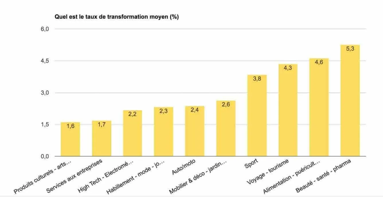
Before optimising anything, you need to understand how your performance compares with others in your sector. A 2% conversion rate may be excellent for a premium ecommerce brand and disastrous for a local service provider. Context matters as much as the number itself.
For B2B and local service providers, a rate between 3% and 6% is a strong result. Below 1%, there is clearly a structural issue: either the website does not inspire trust, the offer is not clear enough or the traffic is poorly qualified, meaning the visitors do not match your target audience. We have seen SME websites converting at 0.3% while direct competitors reached 5% with the same type of audience. The difference? Simply the clarity of the offer and the quality of the contact form.
For ecommerce websites, the calculation is different: the conversion is a purchase, and rates are naturally lower because buying requires greater commitment than submitting an enquiry. Even at 1%, however, the gains from optimisation can be substantial when the average order value is high. Our WooCommerce agency explores the specific requirements of ecommerce projects.
| 01Sector | 02Average conversion rate | 03Top 25% |
|---|---|---|
| 01B2B services | 2–4% | 7–10% |
| 02Trades and local services | 3–6% | 8–12% |
| 03General ecommerce | 1–3% | 5–8% |
| 04Property | 2–3% | 6–9% |
| 05Consulting and advisory services | 3–5% | 8–14% |
| 06B2B SaaS and technology | 2–4% | 8–12% |
B2B services
Trades and local services
General ecommerce
Property
Consulting and advisory services
B2B SaaS and technology
Étape 1
In less than five seconds, visitors should understand what you do, who you do it for and why they should choose you over a competitor. If your homepage headline says ‘Welcome to [Company], supporting your projects since 2003’, you have a problem. Reframe it around a tangible benefit: ‘We deliver a website that generates leads in six weeks’ is infinitely clearer. One construction-sector client changed nothing but its homepage headline, and quote requests rose by 34% over the following month.
Étape 2
Every additional second of loading time reduces conversions by 7%. If your website takes five seconds to appear on mobile, 35% of your potential leads may disappear before the page is even visible. Google PageSpeed Insights gives you a score in 30 seconds. The quickest gains usually come from compressing images in WebP format, enabling browser caching and using a CDN. If your WordPress website takes more than three seconds to load on mobile, the cause is often an overly heavy theme or a build-up of unnecessary plugins.
Étape 3
An effective CTA (call to action) combines three things: visibility, with a colour that contrasts with the rest of the page and a sufficiently large size; benefit-led wording, such as ‘Get my free quote’ rather than ‘Contact us’; and positioning, so it appears without scrolling and recurs at sensible points on long pages. On most of the SME websites we audit, the primary CTA is either too visually discreet or too generic to prompt action. This is often the first change to make, and one of the quickest.
Étape 4
Every extra field in your contact form reduces conversions. The rule is simple: ask only for the information you need to respond to that initial enquiry. First name, email address and message are enough in 90% of cases. A telephone number can be optional. A postal address, business activity code or annual turnover? No. You can collect those details during the first conversation, not before it. All other things being equal, a three-field form consistently converts better than an eight-field one.
Étape 5
Visitors discovering your website instinctively look for signals of trust. Customer testimonials with a name, company and tangible result; logos of recognised clients; Google ratings; certifications; and case studies supported by figures all reduce perceived risk and lower the barrier to action. Imagine you need a plumber urgently and have two websites in front of you. The first displays no reviews. The second has 47 Google reviews and three testimonials with photographs. Which one do you call? Your prospects make exactly the same calculation within seconds.
Étape 6
In 2026, more than 60% of web traffic comes from mobile devices. Yet many SME websites have mobile conversion rates two or three times lower than on desktop because the website was designed for a computer and only minimally ‘adapted’. Good responsive design is not simply a matter of stacking blocks vertically: it rethinks the information hierarchy for a finger and a six-inch screen. Our responsive testing guide explains what truly separates a basic adaptation from a genuine mobile experience.
Étape 7
Sending all your advertising traffic to your homepage is a common and costly mistake. A landing page dedicated to a single offer, with one CTA and no distracting navigation, generally converts two to three times better than a generic page. One SME was spending €2,000 per month on Google Ads and sending every visitor to its homepage, where people became lost among 12 separate offers. After dedicated pages were created for each offer, its cost per lead fell by 75% within three months. Our guide to Google Ads landing pages explains how to create one that genuinely converts.
Étape 8
Between arriving on your website and contacting you, visitors often face too many steps or too many invisible obstacles. Analyse this journey with a session-recording tool: where do people leave the website? On which page? At what point in the scroll? One legal consultancy discovered that 70% of visitors abandoned the process just before the form because they were required to create an account. Removing that requirement tripled enquiries within two weeks. The problem was not the price or the offer, merely unnecessary friction.
You cannot improve what you do not measure. Before applying the changes above, you need to know exactly what is happening on your website. Forget impressions and intuition: you need data. The tools are available, most are free, and they take less than an hour to install.
Google Analytics 4 is the essential starting point. If you have not yet configured it, make that your first priority. It will show your overall conversion rate, most-visited pages, best-performing traffic sources and the paths visitors follow before converting or leaving. GA4 tells you what happens, however, not why. To take this further, read Landing Pages.
To understand why, add a session-recording tool. Microsoft Clarity is entirely free, has no volume limit and takes two minutes to install by copying and pasting a small piece of code. It records anonymised visitor sessions, produces click and scroll heatmaps, and automatically detects ‘rage clicks’: moments when someone repeatedly clicks an element that does not respond. This is often where you discover your real problems rather than the ones you imagined.
Here is a practical example. A consultancy showed us its Clarity recordings, and we realised that 40% of visitors were clicking the logo in the navigation bar because they were looking for a way back to the homepage, which was not linked anywhere else. The fix took one hour. Its impact was visible in the bounce-rate figures the following week. The costliest problems are sometimes the easiest to correct, provided you can see them.
The optimisations described in this guide can achieve a great deal, but they are not always enough. There comes a point when the problem is no longer a poorly placed CTA or an overly long form, but the structure of the website itself. A website built eight years ago on an outdated CMS, with a confusing page architecture and a design that no longer reflects your positioning, quickly reaches the limit of what can be optimised. Our page on Website Design explains the next step.
The signs that a redesign is the logical next step include a bounce rate consistently above 70%; a conversion rate stuck below 1% despite several optimisation cycles; a website generating few or no organic leads; or a visible gap between the reality of your company and the impression created by your website. We regularly see companies that have developed considerably while their websites still make them appear small and poorly organised. The result is conversions lost silently, every day.
In these cases, incremental optimisation is often a waste of time and money. A well-managed redesign that rethinks the architecture, design, user experience and conversion journeys from the outset can transform performance. Our website redesign service is designed for exactly this purpose: building on sound foundations rather than simply repainting the walls. If you are not sure whether you have reached that point, our SEO redesign method will help you identify the critical issues.
Conversion rate is not an abstract metric reserved for marketing specialists. It is the measure that tells you whether your website is working for or against you. Traffic without conversions is visibility without results. At a time when every euro invested in SEO or advertising must be justified, ignoring conversions is a luxury few SMEs can afford.
Start by measuring your current conversion rate accurately. Then use the right tools to identify your two or three main sources of friction, and tackle them in order of likely impact. After several optimisation cycles, ask yourself honestly: is this an issue that can be adjusted, or a structural problem requiring a complete redesign?
The answer changes your entire strategy and the return on investment that follows. Our page on Core Web Vitals explains the next step.
UX, UI and responsive design: we create websites that look sharp and perform for SMEs.
Keep exploring


A project in mind?
Start with a free audit grounded in your goals, website and data.
Discutons de votre projet
30 min · Google Meet
Choisissez le créneau qui vous convient dans notre calendrier. On analyse votre situation avant l’appel pour aller droit au but.
Finding available times...